Olivia Douglass: Ordinary Dreams
Project
9 March – 7 May 2023
This website uses cookies
By continuing to use this website, you agree to our Privacy Policy, Terms of Use, and Disclaimer.
This website uses cookies
By continuing to use this website, you agree to our Privacy Policy, Terms of Use, and Disclaimer.
Analytics
Google Analytics uses a set of cookies to collect information and report site usage statistics without personally identifying individual visitors to Google. ‘_ga’, the main cookie used by Google Analytics, enables a service to distinguish one visitor from another and lasts for 2 years. Any site that implements Google Analytics, including Google services, uses the ‘_ga’ cookie. Each ‘_ga’ cookie is unique to the specific property, so it cannot be used to track a given user or browser across unrelated websites.
Google services also use ‘NID’ and ‘ENID’ cookies on Google Search, and ‘VISITOR_INFO1_LIVE’ and ‘YEC’ cookies on YouTube, for analytics.
Managing Cookies
Most browsers allow you to manage how cookies are set and used as you’re browsing, and to clear cookies and browsing data. Also, your browser may have settings letting you manage cookies on a site-by-site basis. For example, Google Chrome’s settings at chrome://settings/cookies allow you to delete existing cookies, allow or block all cookies, and set cookie preferences for websites. Google Chrome also offers Incognito mode, which deletes your browsing history and clears cookies on your device after you close your Incognito windows.
Gerardo Velázquez.otf is a commissioned work that is part of the project Even When We Can’t We Must, honouring Norway’s Queer Culture year. For the duration of the work, Nat Pyper’s typeface Gerardo Velázquez replaced the header typeface on Kunsthall Stavanger’s website. Below follows a conversation between Nat Pyper and Curator Kristina Ketola Bore.
Kristina Ketola Bore: This work is the first in a series of digital projects titled Even When We Can’t We Must that Kunsthall Stavanger has initiated as part of Queer Culture Year in Norway. In 2022, Norway is commemorizing 50 years since the abolition of a law that stated that sexual interaction between men was forbidden. Effectively, the termination of this law decriminalised the act of being gay in Norway.
For the project, I have invited artists who use text in different ways to create new works for our digital
Gerardo Velázquez.otf is a commissioned work that is part of the project Even When We Can’t We Must, honouring Norway’s Queer Culture year. For the duration of the work, Nat Pyper’s typeface Gerardo Velázquez replaced the header typeface on Kunsthall Stavanger’s website. Below follows a conversation between Nat Pyper and Curator Kristina Ketola Bore.
Kristina Ketola Bore: This work is the first in a series of digital projects titled Even When We Can’t We Must that Kunsthall Stavanger has initiated as part of Queer Culture Year in Norway. In 2022, Norway is commemorizing 50 years since the abolition of a law that stated that sexual interaction between men was forbidden. Effectively, the termination of this law decriminalised the act of being gay in Norway.
For the project, I have invited artists who use text in different ways to create new works for our digital platform. In this case, my interest in language stems from the power of text and language in queer activism, for example through art and design, protest and oral history. The other participating artists are writer and poet Olivia Douglass, artist virgil b/g taylor and activist, influencer and performance artist Zutana Haddadeen, all of which will present their projects in the coming year. You’re all artists who in different ways are activating queer perspectives in your practices, and whom I consider to both have important voices and an artistic resonance. What was your initial response when invited to this project?
Nat Pyper: The invitation arrived in the context of increasing anti-trans and anti-queer violence, sentiment, and legislation worldwide. It’s been especially felt in the States, where a sweeping “pronoun panic” has targeted anything outside of the sex/gender norm. Drag shows at the center of the culture wars in 2022, can you believe it! It’s incredibly repressive and backwards, but also comes too late. Queer people across the spectrum are here to stay, and we have decades of resistance, public displays of pride, and direct action to thank for it.
The project gained renewed significance for me after the mass shooting in Oslo that targeted queer nightlife and two gay men lost their lives. And again, here in Colorado, another shooting at a queer nightclub that claimed several lives, it’s all too familiar and commonplace. Now as ever, it’s important to take up space and celebrate queerness in its fullness, especially when it’s offensive, especially when it challenges the status quo.
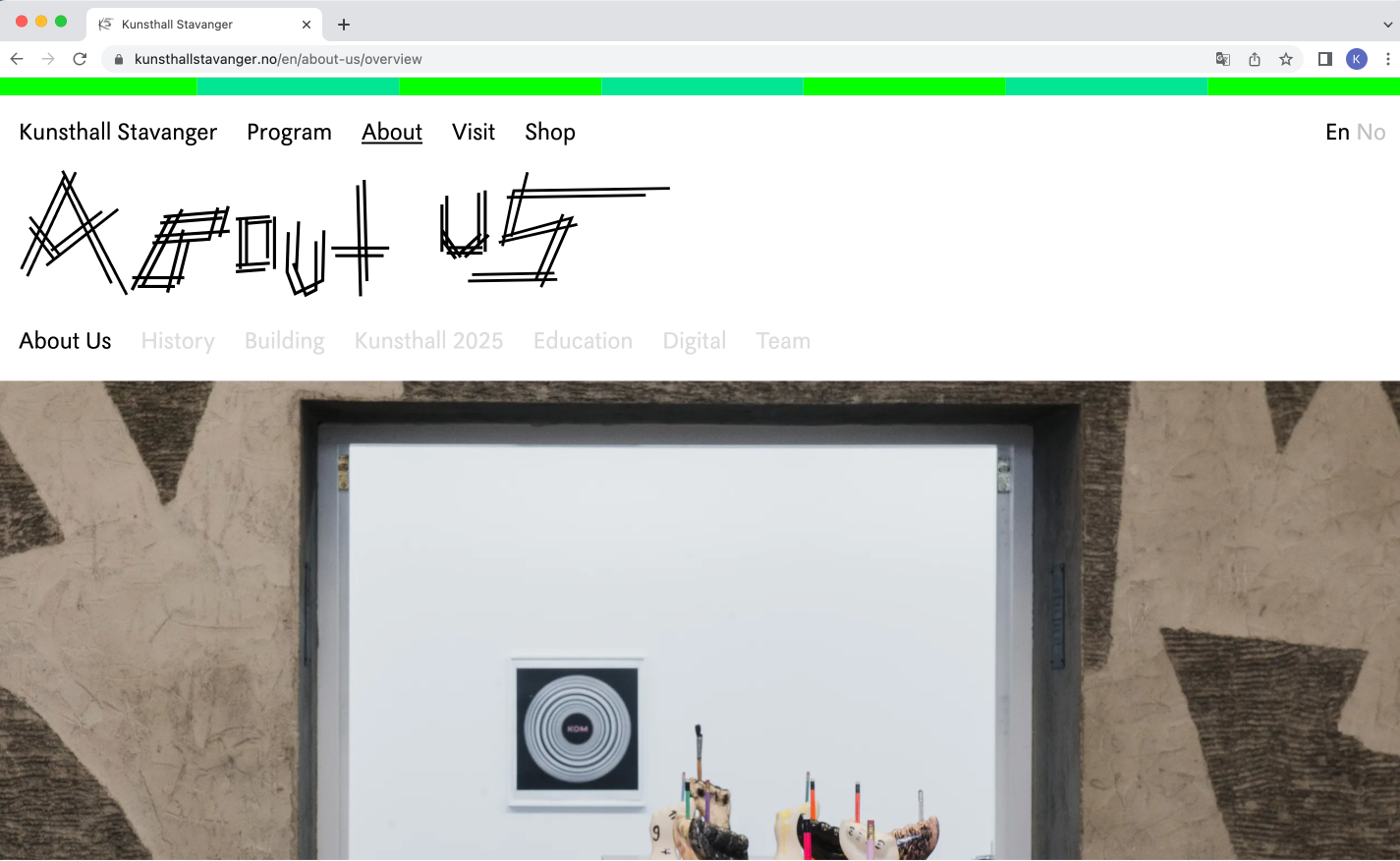
KKB: Your work will change the header typeface Placard KS throughout our website to the typeface Gerardo Velázquez for the duration the work is up. Gerardo Velázquez.otf (otf refering to the file type Open Type Format) is part of the ongoing series, A Queer Year of Love Letters, which you have been working on since 2018, where you create typefaces based on activists, queer icons and artists. Could you introduce us to the background for this project, and where does this new typeface sit in that series, what does it add? Also, how does it feel to make this typeface for us, an art institution?
NP: The project began a couple of years into my research on queer publishing histories. It took time to understand my relationship to these histories, to develop a position, a position that is still actively evolving. I was looking for ways to share this work with others who might not yet know it, but I wasn’t interested in taking on the role of historian or scholar. At first I looked to external models for organization like indexes and collections and things of this nature, but nothing really fit. Then I started looking for methods within the histories themselves. Something that came up again and again was maps. So I started thinking about how to constellate what I was learning. There’s a great example of this in a queer anarcho-punk zine called Homocore published out of San Francisco. A contributor named Steve Abbott called on readers to “dig our heroes out of the trash” by making histomaps of influential queer figures. In his words, “It’s your life so be your own teacher.”
Because these are often histories of writing and publishing, I was also looking for a medium that could speak to this textuality. Fonts were close to me, something I was already making as a graphic artist, and I appreciated the poetic value they offered as language objects. At the beginning I was churning out new fonts very quickly, about once a month, and I decided I’d continue the project for a year which led to the name A Queer Year of Love Letters. Twelve fonts in twelve months. It was romantically ambitious. The pace has slowed, but it’s a comfortable pace. This is the sixth font in the series, about three years into the project.
What does it mean to memorialize the life and work of Gerardo Velázquez, a gay Chicano immigrant heavily involved in the underground punk scene in Los Angeles, USA, here on the website for Kunsthall Stavanger, an art institution in Norway? My research-driven creative practice is often one of holding: I learn about these histories, I hold them, and I pass them on. For the duration of this project, Kunsthall Stavanger holds this history with me. What I’m interested in is this relational capacity for holding, a practice against forgetting. It’s not a one-sided holding, either. Gerardo is holding Kunsthall Stavanger, too.
KKB: This idea of holding and passing on a history gives your project a very tangible feel in the digital space, which we often think of as separate from our physical bodies. For us as an institution it is very exciting that our digital platform presents the opportunity for artists to interject works and ideas into the structure of the institutional voice and representation in this way. It feels as if this is particularly important when presenting works that in different ways activate queer perspectives and histories that are underrepresented in these spaces. Anyone interacting with our website will have to interact with your work. What are your thoughts on this?
NP: This series of fonts highlights the work of countercultural queers over the past several decades. There’s a conspiratorial aspect to the project: information about the artists and their work is inserted into the metadata of the font. And of course there’s the name itself, in this case Gerardo Velázquez, which is the first clue that this font is maybe something other than just a font. The font is a portable memory unit. Its users, knowingly or unknowingly, call attention to this history. There’s another layer now with the font’s presence on the Kunsthall Stavanger website. Gerardo’s work travels to Norway, and beyond. I guess it’s an attempt at a kind of anti-assimilation. It reminds me of a quote by Françoise d’Eaubonne (mother of ecofeminism), “It’s not a question of integrating homosexuals into society, but of disintegrating society through homosexuality.”
KKB: I appreciate you highlighting that the work is creating friction and perhaps interruptions for visitors, due to it not having characteristics of a typeface we are used to reading. For me that is a very important aspect of the work; to allow ourselves to sit with something unfamiliar or unknown, and that queer culture doesn’t have to be commodified or the subject of the heteronormative gaze. It exists in itself.
For the Queer Culture Year project, we have borrowed the title Even When We Can’t We Must from one of your works. Could you say a little bit about what that title meant for you at the time of making the work and what it means for you today?
NP: We all witnessed the civil unrest that swelled in the summer of 2020, people across the world coming together against state-sponsored racial injustice. The protests happened at a time when we were still learning what it was going to mean to live and die with COVID. Everyone was still very cautious, avoiding crowds and gatherings, but the urgency of that moment could not be ignored. It was work that needed to be done, despite the risk. Our collective future was and is at stake. So the title came from bearing witness to that moment: even when we can’t, we must.
KKB: It is such a powerful statement, and something worth reminding ourselves of. I also appreciate that it speaks to vulnerability and how often the path of being strong first begins with acknowledging that we are allowed to feel weak. I wonder, what was the initial appeal for you when going into Nervous Gender and Gerardo Velázquez’s work? I had never heard of Nervous Gender before you introduced them to me, even if I have an interest in LA’s punk scene from that time and the 80s. Several punk bands back then were using elements from performance art or taking in elements from the art scene in their music and stage appearances, including Nervous Gender. However, the most dominant part of the punk scene was very white and very heteronormative.
What do you think translates from that moment in time? Do you consider the typeface as a time document or does it speak to something contemporary? What do you hope people will take from the typeface and work?
NP: Gerardo Velázquez was a misfit’s misfit. He was too punk for the punks and too queer for the queers. He was an artist, a poet, a writer, a musician, a provocateur, constantly moving between mediums and obsessions, always on his own terms and always resisting legibility. He was also a part of a burgeoning Chicana/o noise and punk rock movement in East Los Angeles in the late 1970s that included other bands like The Bags, The Zeros, The Brat, The Plugz, and The Stains, to name a few. A lot of my research is focused on the queercore punk scene of the late 80s and 90s, but I became interested in the lineages that led to that point. Who were the forebears that made queer punk possible? Gerardo was one of those forebears.
Gerardo was a founder of the synthpunk band Nervous Gender, a band that’s been described as “the thorn in the side of the L.A. music scene.” Other founding bandmates include Michael Ochoa, Edward Stapleton, and Phranc. They were raucous and confrontational, embracing taboo and unafraid of making their audiences squirm. At a time when punk music might still be considered catchy, the infamous punk fanzine Slash described their sound as “absolutely un-hummable.” The name Nervous Gender says it all: they maintained an uneasy relationship to identity by rejecting stable norms. They set a precedent that continues to offer up new possibilities for today. And Gerardo was at the center of that.
The queer figures that I look to for strength and inspiration embody that spirit of self-determination while also being deeply embedded in collective struggles. As a reflection of that, the fonts in this series are free to use. They need to be. The work doesn’t stop with the font itself. The work is completed when others use the font to write something new. And in this way the work is also never completed, it is always in need of new use. Gerardo Velázquez.otf is a means, a form. It anticipates content, which isn’t to say that it’s neutral or without temperature. These fonts cite histories, but they are also tools for the present to shape the future.
Are these people my family? Is there some familial relation? No, not literally. But there are connections that could be called lineages. Cultural lineages, identity lineages, lineages of queer acts. At the same time, the abolition of the family as a discernible and destructive social unit becomes more and more compelling. If “family” is on its way out, if it no longer works as a useful metaphor, then what is my relationship to these people and their work? This is where love comes in. Yes, there’s a kind of love that feels familial, but also a fanatic love, a romantic love, an unrequited love, a jealous love, an incestual love. I like that it’s not so straightforward. Love is messy.
Curator: Kristina Ketola Bore
Developer: Bryant Wells
The year 2022 marks the 50th anniversary of the repeal of a law that prohibited sexual acts between men 50 years ago, effectively decriminalising being gay in Norway.
Kunsthall Stavanger honours Queer Culture Year with a new digital project consisting of four commissioned works by Nat Pyper, Olivia Douglass, virgil b/g taylor and Zutana Hadaddeen. The works will be presented as interactive projects on our digital platform, with the first premiering in December 2022, and the others to follow in February, May and July 2023.
Nat Pyper is an alphabet artist. In their work and writing, they use language as a sieve and they push the body through it. They also maintain ongoing research on queer anarcho-punk zines of the late 80s and early 90s. Their practice extends from this unruly history and its embodied politics of refusal. Their visual work has shown at Chuquimarca Projects, Gene Siskel Film Center, and RUSCHWOMAN in Chicago, Vox Populi in Philadelphia, and Printed Matter in New York City. Their written work has been published by Are.na, Draw Down Books, Drawstring Magazine, GenderFail, Inga Books, Martian Press, Queer.Archive.Work, and the Walker Art Center. They received their MFA from the Yale School of Art.
Gerardo Velázquez wrote filth poetry. No taboo was off limits. As a self-described militant homosexual, he skewered societal norms through his transgressive sound art, performances, computer graphics, song lyrics, and poems. Velázquez was born in Mexico in 1958 and later immigrated with his family to Los Angeles. In 1978, he co-founded the infamous synthpunk band Nervous Gender alongside bandmates Michael Ochoa, Edward Stapleton, and Phranc. The band emerged from the early LA punk scene of the late 1970s wielding synthesizers in lieu of guitars. Their sound was raucous and confrontational, fondly described by punk fanzine Slash as “absolutely un-hummable.” They released their album Music From Hell in 1981. Velázquez would later publish zines with titles like The Annals of Selective Annihilation and The Gay Death List that used acidic satire to chronicle his experience as a gay man living with HIV. He died of AIDS-related complications in 1992.


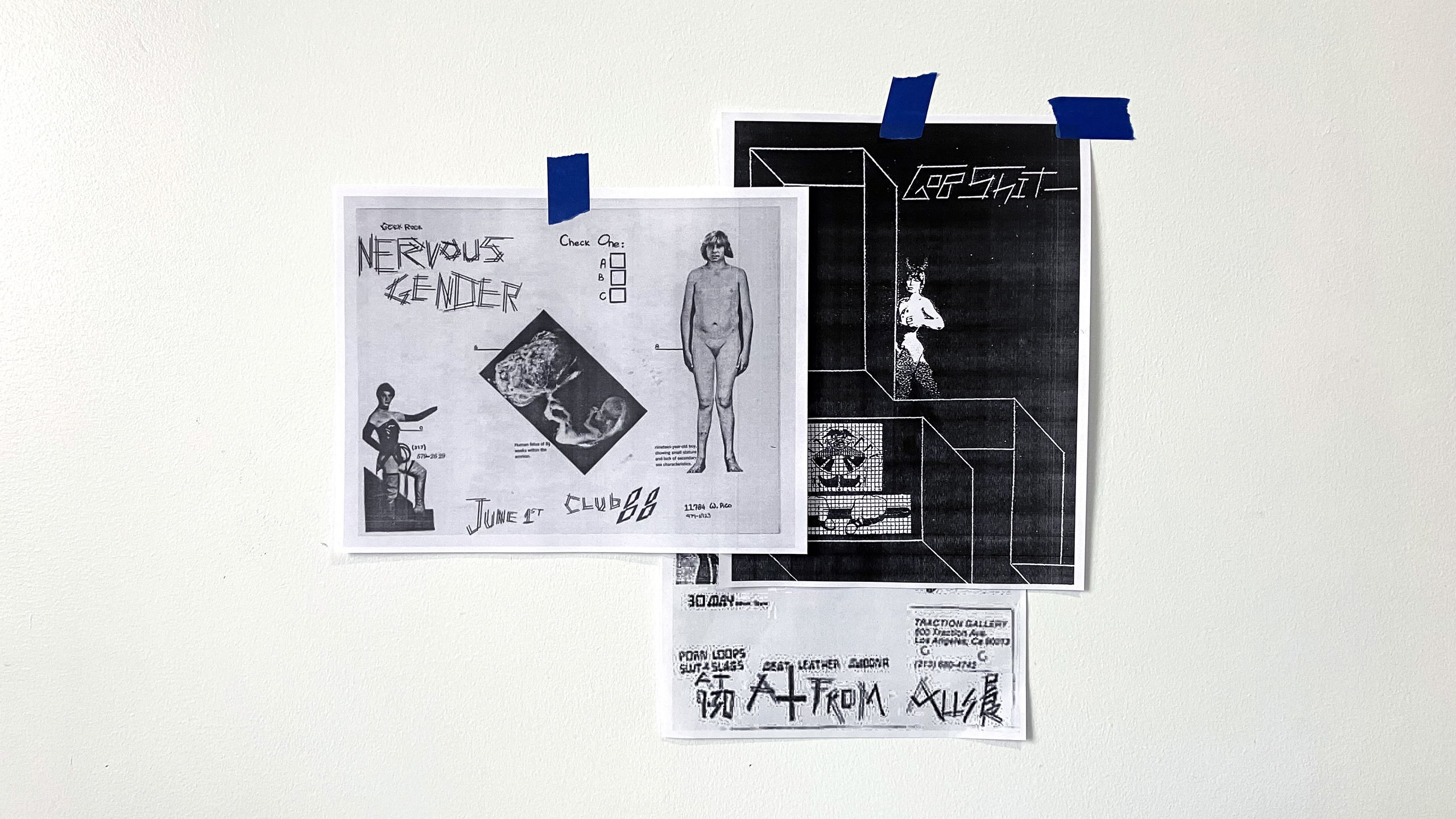
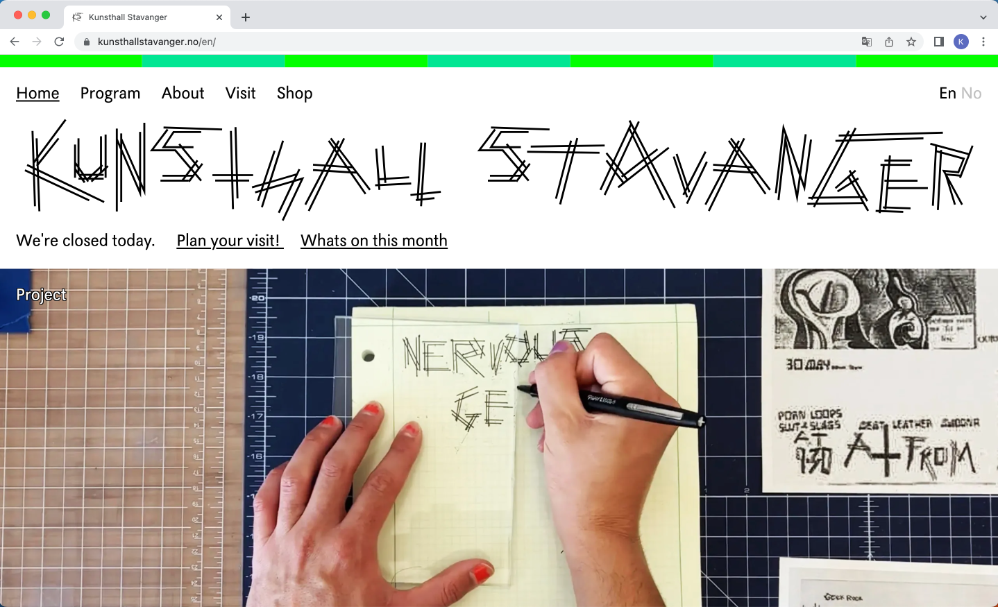
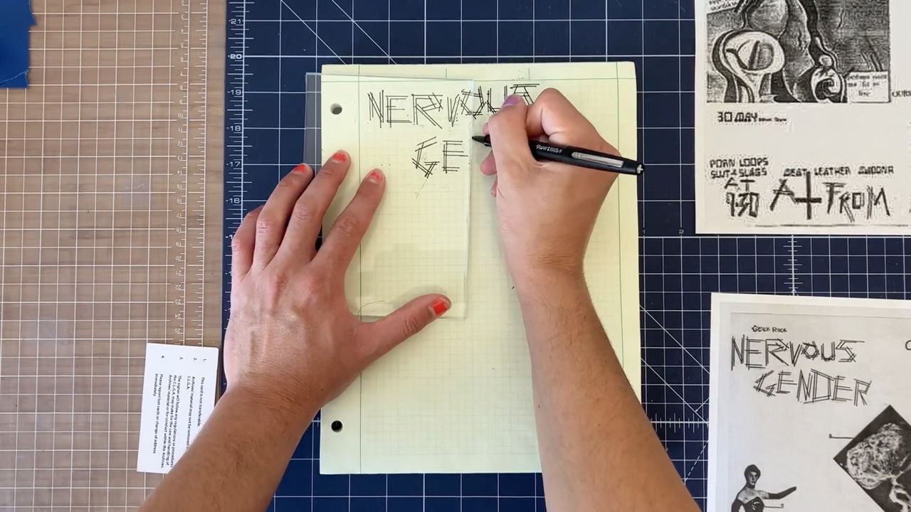
Documentation of Nat Pyper's process.

Type sample of Gerardo Velázquez.

Type sample of Gerardo Velázquez.

Type sample of Gerardo Velázquez.